Have you ever been in a room full of people who are speaking your language, yet you have no idea what they are saying? You are either in the wrong room or, you need to get up-to-speed on the terminology of the environment. Graphic design is a creative field full of innovative and inspiring ideas so without certain universal phrases and terms, there is an enormous risk of miscommunication. Whether you are brand new in the field or you are a seasoned professional, it is vital to stay informed when it comes to graphic design terminology.
Here's an A-Z glossary of some of the more commonly used terms.
A - Alignment
Alignment is a fundamental principle in graphic design that involves carefully arranging all visual elements, usually on a grid. Proper alignment ensures a neat, ordered appearance, making designs more readable and visually appealing.
B - Bitmap
A bitmap based image is made up of pixels in a grid. Each pixel is assigned a specific colour, making these images ideal for complex compositions like photographs. However, they lose quality when scaled. These are also called raster images.
C - CMYK
CMYK stands for Cyan, Magenta, Yellow, and Key (black). It's a colour model used in colour printing that combines these four ink colours to create a wide range of tones. CMYK is the standard for print projects.

D - DPI
Dots Per Inch (DPI) measures the resolution of an image, specifically the number of dots that can fit into a linear inch. The higher the DPI, the sharper and more detailed the image will be.
E - EPS
Encapsulated PostScript (EPS) is a vector file format that is used to transfer PostScript artwork between applications. It's widely used for printing to PostScript printers and image setters.
F - Font (vs. Typeface)
Typeface is a set of characters that share common design features. A font is a specific style and size of a typeface. Understanding the difference is crucial for correct communication in design.

G - Grid
A grid is a series of intersecting horizontal and vertical lines used to structure content. It's an efficient and effective tool for creating consistent and well-organised layouts.
H - Hierarchy
Visual hierarchy is the arrangement of elements in a design in a way that implies importance. It guides the viewer’s eye to where they should look first, second, and so on.
I - Illustrator
Adobe Illustrator is a vector graphics editor and design program used by graphic designers to create vector images. It's essential for designing logos, icons, and other scalable graphics.
J - JPEG
Joint Photographic Experts Group (JPEG) is a widely used format for saving images, especially for the web. It uses compression to reduce file sizes but can result in a loss of quality.
K - Kerning
Kerning refers to the adjustment of space between two characters in a typeface. Proper kerning ensures that the spacing between characters is visually pleasing and consistent.
L - Layer
In graphic design software, layers are used to separate different elements of a design. This allows for more flexible editing and organisation of components.
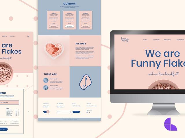
M - Mockup
A mockup is a full-size model of a design used for demonstration, evaluation, or promotion. It helps clients visualise the final product in a real-world context.

N - Negative Space
Negative space, or white space, is the unmarked space around and between the elements of a design. It's an essential component of composition, enhancing readability and balance.
O - Opacity
Opacity refers to the transparency level of an element in a design. Adjusting the opacity can create depth and emphasis by making elements more or less pronounced.
P - Pantone
Pantone is a standardised colour matching system that helps designers ensure consistency in colour across different mediums and materials.
Q - Quality
When used in design terms, quality refers not only to the aesthetic appeal of a piece but also to its functionality, usability, and effectiveness in communicating a message.
R - Resolution
Resolution is the detail an image holds. Higher resolution means more image detail. It's especially important in printing, where high resolution is needed for clear, crisp images.
S - SVG
Scalable Vector Graphics (SVG) is a vector image format for two-dimensional graphics with support for interactivity and animation. SVGs are resolution-independent, making them ideal for web use.

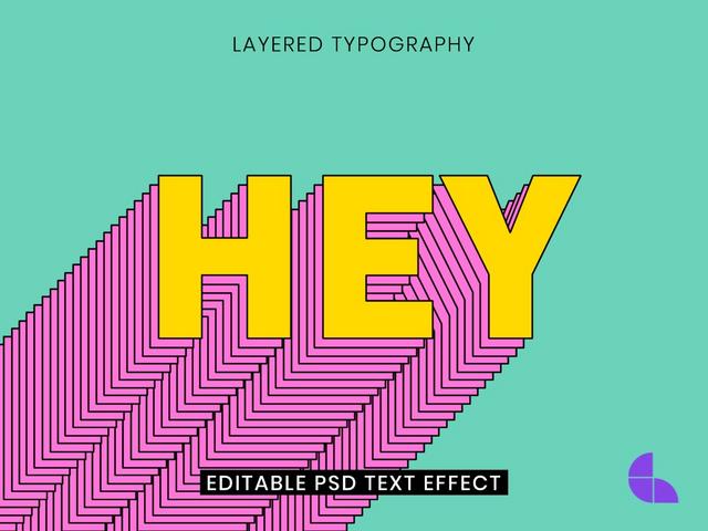
T - Typography
Typography is the art and technique of arranging type to make written language legible, readable, and visually appealing.
U - UX Design
UX is abbreviated from User Experience and is the process of creating digital products (websites/apps/programs) that are designed to provide meaningful and relevant experiences to users. This involves the design of the entire process of navigating and integrating the product, including aspects of branding, design, usability, and function.
V - Vector
Vector graphics are composed of paths, which are defined by a start and end point, along with other points, curves, and angles. Unlike bitmaps, they can be scaled indefinitely without losing quality.
W - Wireframe
A wireframe is a visual blueprint for a project. It is a basic visual guide used in interface design to suggest the layout of fundamental elements in the interface. Note: User Interface (UI)
X - X-height
The x-height refers to the height of the lowercase "x" in a given typeface. This measurement is used to describe the general proportion and size of lowercase letters compared to the uppercase letters.
Y - Y-axis
The y-axis is the vertical line on a 2 dimensional graph. It's also the zero starting point used to determine where a point lies on the x-axis (the horizontal line).
Z - Zoom
In graphic design software, the zoom tool allows designers to magnify or reduce the view of an image or a detail of the image.
This A-Z of graphic design terms is a basic starting point and should not be mistaken for an exhaustive list of terms. As the tools of design advance with technology, so too does the terminology making it even more important for designers to remain vigilant and keep learning. Terminology is not about simply sounding clever, it is a means of communication that is vital in any field of design. It helps remove ambiguity and allows team members and clients to have a clear understanding of a project’s development.
Whether you're looking to kickstart your career or embark on a personal creative journey, our experienced tutors can provide a hands-on, engaging learning experience.
With courses that include fundamental concepts to advanced techniques, we cover everything from typography and layout to digital illustration and UX design. By the end of your journey with us, you'll not only have a profound understanding of graphic design principles but you will also be armed with a robust portfolio to showcase your unique creative voice.
Dive into the world of graphic design and turn your passion into a profession.

